Public health analytics
Food Inspection Analytics Dashboard
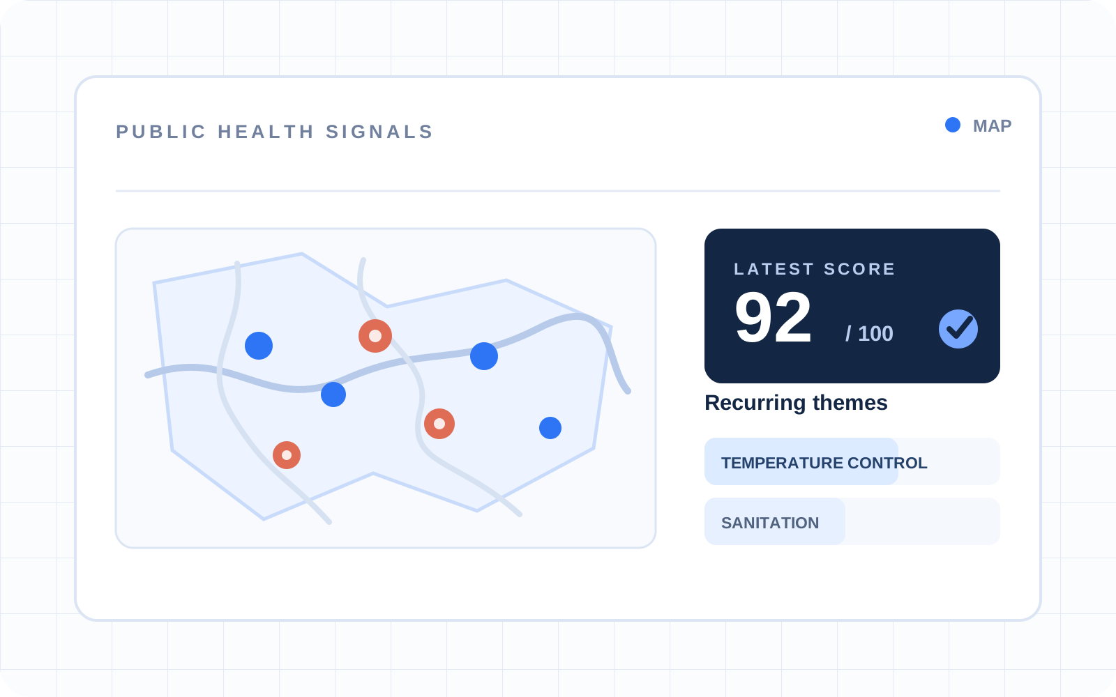
Where do food-safety violations cluster? A Tableau Public dashboard of King County, WA inspections that maps scores and ranks the most common violations.
Problem
Food-inspection records contain geographic, operational, and violation-level detail that is difficult to understand from rows of data alone.
Challenge
Create a single interactive view that helps a reader explore where inspections occur, how scores vary, which violations appear most often, and how patterns change over time.
My role
I designed and built it in Tableau Public: the inspection map, the ranked-violations view, the trend view, and the business and status filters.
Dashboard structure
- 1Public food-inspection records
- 2Geographic inspection and score view
- 3Top-violation treemap
- 4Inspection trend view
- 5Business and closure-status filters
Technologies
Approach
- Use a map to connect inspection results to place and score.
- Pair the geographic view with violation and time-based summaries.
- Let viewers narrow the dashboard by business and closure status.
Current result
The published dashboard lets viewers explore inspection locations, score ranges, common violation types, trends over time, and individual businesses in an interactive Tableau workbook.
Lesson
A useful analytical dashboard combines complementary views: location supplies context, ranked categories show concentration, and trends reveal change over time.
Open the interactive Tableau dashboard